

Editing your real estate photos isn't just one step; it's a four-part process that takes you from a memory card full of images to a polished, professional listing. It all boils down to importing and organizing your shots, adjusting exposure and color, correcting perspective, and finally, exporting the finished product. When you get this workflow down, your properties will look bright, inviting, and professional every single time.
Your Foundation For Flawless Photo Edits
Before you even think about touching a single slider in Lightroom, the real magic happens in the setup. I’ve seen it time and again: the best edits come from a methodical foundation, not from last-minute editing tricks. This initial stage is all about getting organized. Trust me, it will save you hours of headaches later.
The whole thing kicks off the second you pop that memory card into your computer. A messy import is a recipe for lost files and wasted time. By building a repeatable system from the start, you give every project the same level of professional care.
This visual breaks down the essential workflow I use for editing real estate photos.
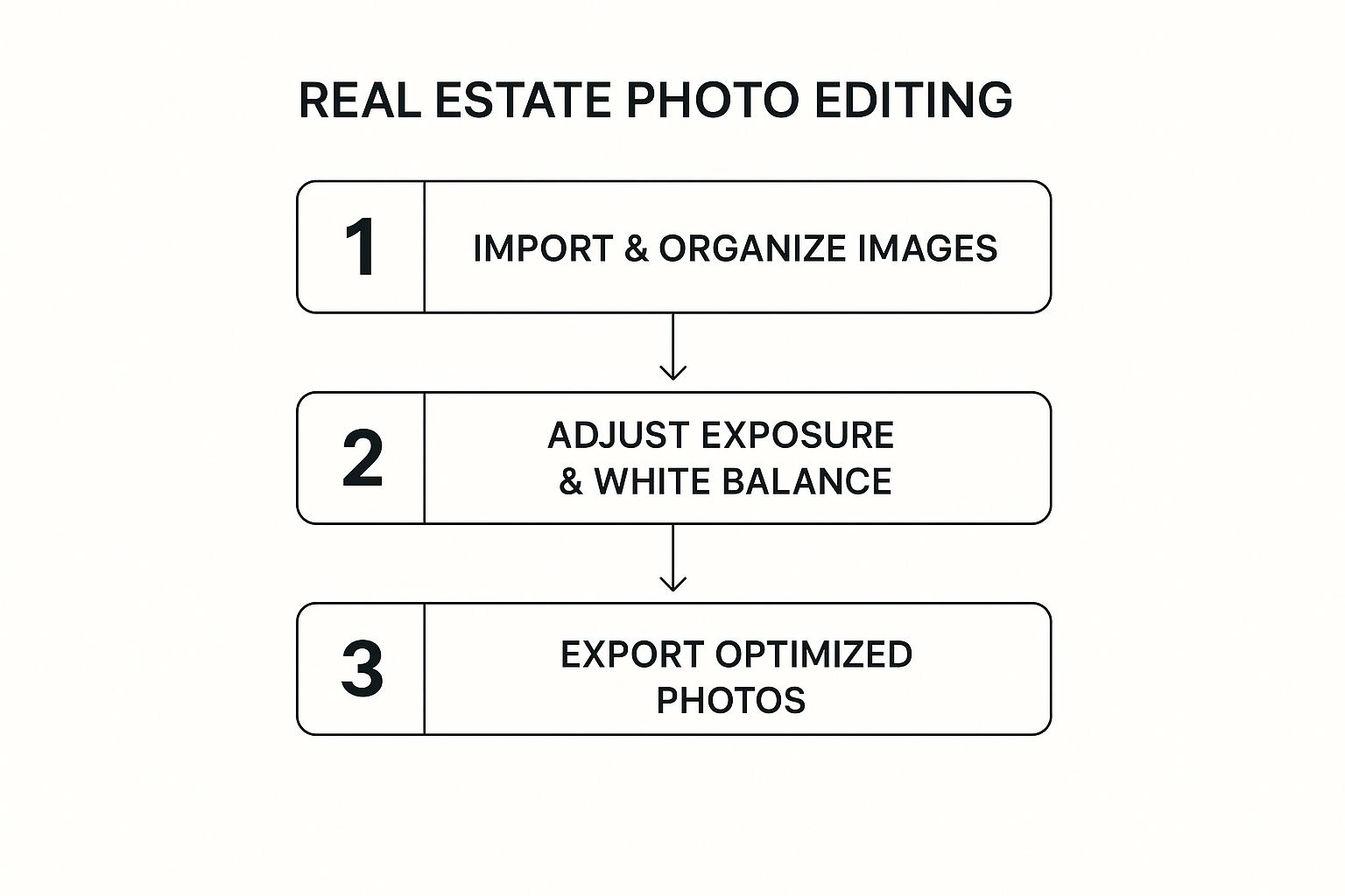
As you can see, a logical flow—from organization to final export—is the absolute backbone of editing efficiently.
Start with RAW Files for Maximum Flexibility
Always, always shoot in RAW. I can't stress this enough. JPEGs might look decent straight out of the camera, but they're compressed files that throw away a massive amount of image data. Think of it this way: a JPEG is a finished cake, while a RAW file is all the ingredients. With the ingredients, you can bake whatever you want.
Shooting in RAW gives you the power to:
- Recover Details: Easily pull back those blown-out highlights in a bright window or lift the deep shadows in a dark hallway without making the image look grainy and weird.
- Correct White Balance: Nail the wall colors every time. You can effortlessly fix the yellowish cast from indoor lighting and make those whites look pure white.
- Make Non-Destructive Edits: Your original photo is always safe. Adjustments are just saved as a set of instructions, so you can always go back to the original.
Create a Repeatable Import and Culling Process
Consistency is your best friend here. Get into the habit of using a simple folder structure for every single property. Something like Client Name > Property Address > RAW and a separate folder for your final Exports works perfectly. This simple system keeps everything neat and easy to find.
During your Lightroom import, make it a habit to apply lens corrections right away. Most lenses, especially the wide-angle ones we use for interiors, introduce a bit of distortion or dark corners (vignetting). A single click to apply a lens profile correction instantly straightens lines and brightens corners across all your photos at once. If you want to dive deeper into building a solid workflow, check out our guide on how to edit photos professionally.
To make this initial prep work second nature, here's a quick checklist you can reference for every shoot.
Essential Real Estate Photo Prep Checklist
This table is your quick reference to ensure your images are perfectly prepared for editing every single time.
| Action | Tool/Method | Why It Matters |
|---|---|---|
| Shoot in RAW | Camera Settings | Gives you maximum data for recovering details and correcting colors without quality loss. |
| Create a Folder Structure | File Explorer / Finder | Keeps projects organized, prevents lost files, and makes finding images a breeze. |
| Apply Lens Corrections | Lightroom Import Panel | Instantly fixes distortion and vignetting, ensuring straight lines and even lighting. |
| Cull Ruthlessly | Lightroom Library Module | Saves time by eliminating weak shots early, so you only edit the best images. |
Following these simple steps lays the groundwork for a smooth and professional editing session.
After importing, your next job is culling—that is, picking the winners and ditching the rest. Don't get sentimental. Quickly flag your best compositions and reject anything that's blurry, poorly framed, or redundant. A ruthless culling process stops you from wasting time editing photos that were never going to make the final cut anyway.
Balancing Light and Color to Create an Inviting Space
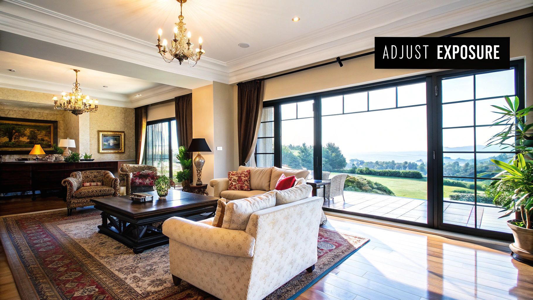
Once your images are sorted, it’s time to get into the heart of the edit. Your main goal here is simple: make a potential buyer feel like they're stepping right into a bright, airy, and welcoming home—not just scrolling through pictures. This is where we’ll master the core adjustments that truly bring a property to life.
A well-balanced photo feels honest. You’re not trying to create a fantasy; you’re just showing the home in its absolute best light. This means pulling details out of dark corners without turning the window into a blinding white rectangle.
Reading the Histogram to Nail Exposure
Before you even think about touching those sliders, take a look at your histogram. This little graph is your best friend for objectively judging the brightness in your photo. A spike on the far left means you’ve got deep, crushed shadows, while a spike on the right means you've got bright, blown-out highlights. Your mission is to shape it into a nice, balanced mountain range somewhere in the middle.
- Shadows and Blacks: Start by gently pushing the Shadows slider to the right. This will start to reveal details hiding in darker spots, like under a staircase or in a corner the light didn’t quite reach. Then, use the Blacks slider to set your true black point, which adds that crucial depth and contrast.
- Highlights and Whites: Next, pull the Highlights slider to the left to bring back information from bright areas like light fixtures or windows. This is absolutely key for avoiding those "blown-out" spots where all detail is lost. Finish up by adjusting the Whites slider to set your pure white point, making the whole image pop.
A classic mistake is cranking the shadows slider way too far. This can introduce a ton of digital noise and just makes the photo look fake. Small, subtle adjustments will always beat drastic changes.
Correcting Pesky Color Casts
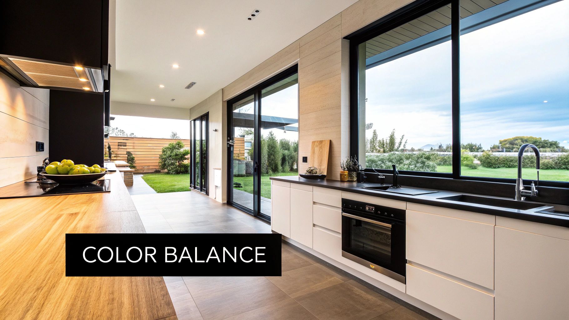
One of the quickest ways to spot an amateur photo is an off-white balance. Ever taken a picture of a room with white walls, only for them to look yellow or blue? That’s a color cast. It usually happens when you have mixed lighting—like warm indoor lamps fighting with cool daylight from a window.
The goal is to make whites look white. The easiest way to get there is with the White Balance eyedropper tool in Lightroom. Just click on a neutral gray or white surface in your image. Honestly, this usually gets you 90% of the way there in a single click. From there, you can do some fine-tuning with the Temp (blue/yellow) and Tint (green/magenta) sliders until the colors look true to life.
Boosting Colors Naturally with Vibrance and Saturation
After you’ve nailed the white balance, you can give the colors a little boost to make the property more appealing. But there’s a very fine line between vibrant and looking like a cartoon.
Here’s the approach I always take:
- Start with Vibrance: This slider is much smarter than Saturation. It focuses on boosting the more muted colors while leaving the already saturated ones alone. This keeps things like skin tones or bright decor from looking weird and unnatural.
- Add a Touch of Saturation: Use the Saturation slider sparingly. A little nudge is all you need to give every color in the image a gentle, uniform lift.
This two-step method makes sure the grass on a lawn looks healthy, not neon green, and that the beautiful hardwood floors feel warm and inviting, not electric orange. If you're looking to speed this all up and maintain a consistent look, using professional tools is a game-changer. You might want to explore our collection of Lightroom presets for real estate photography to see how they work.
Using Technology for High-Contrast Scenes
Sometimes, a single shot just can’t capture everything. You know the scene: a beautifully lit room with a bright, gorgeous view out the window. This is where High Dynamic Range (HDR) blending is a lifesaver, letting you combine multiple exposures into one perfectly lit image. Not long ago, this was a tedious, manual task.
Today, technology has completely changed this part of the workflow. By 2025, artificial intelligence (AI) is set to transform real estate photo editing, with reports showing over 85% of agents are expected to be using AI-powered tools for enhancements. These tools can automate things like HDR blending and even virtual staging with just a few clicks. You can learn more about these fascinating 2025 real estate photo editing trends on beatcolor.com.
Straighten Up Your Shots for a Professional Finish
Once you've nailed the light and color, it's time to tackle the geometry of the room. Nothing screams "amateur" faster than a photo with leaning walls, bowed doorways, or a horizon line that’s just a little bit off. These distortions, however subtle, can make a beautiful space feel wonky and unstable to a potential buyer.
Fixing these perspective issues is one of the quickest ways to give your photos a massive dose of professionalism. The goal is simple: if a line is vertical in real life, it needs to be perfectly vertical in your photo. This creates a sense of stability and architectural integrity that viewers are drawn to, even if they don't consciously know why.
Your Go-To Tool: The Transform Panel
Lightroom's Transform panel is your best friend for this job. It’s built specifically to handle the kind of perspective problems we run into all the time with architectural shots. While you can fiddle with the manual sliders, the one-click "Auto" button is surprisingly smart. More often than not, it does a fantastic job analyzing the image and straightening everything up—both vertical and horizontal lines—in an instant.
For trickier shots where "Auto" doesn't quite get it right, the "Guided" tool is an absolute lifesaver. You just draw two or more lines along surfaces you know should be straight (think door frames, window edges, or the corner of a room), and Lightroom will warp the image perfectly to match. It’s an incredibly powerful way to get flawless geometry every single time.
This is Lightroom's Develop module, which is basically mission control for all the perspective corrections we're talking about.
Pro Tip: Try to shoot from about chest height—around five feet off the ground. This camera position naturally minimizes the "keystoning" effect where vertical lines look like they're falling backward. Getting it right in-camera will save you a ton of editing headaches later.
Don't Forget Lens Profile Corrections
Before you even touch the Transform panel, there’s a crucial first step: head over to the Lens Corrections panel and check the box for Enable Profile Corrections. Wide-angle lenses, which are a must-have for making rooms feel spacious, have a natural tendency to distort the image, making straight lines look a bit curved.
Ticking this one box tells Lightroom to apply a custom-made profile for your exact lens, which instantly fixes three common problems:
- Barrel Distortion: This straightens out those slightly bowed or "fisheye" lines.
- Vignetting: It brightens up the corners of your frame, which often appear a bit darker.
- Chromatic Aberration: This gets rid of any distracting color fringing (usually purple or green) you see along high-contrast edges.
This single click is non-negotiable. After that, you can take your editing even further. If you've developed a look you love and want to apply it to other photos, our guide on how to make presets in Lightroom is the perfect next step.
Finally, don't be afraid to use the crop tool to refine your composition. It's not just for straightening a horizon. Trim away any distracting clutter on the edges of the frame to pull the viewer's eye right where you want it—on the home's most appealing features.
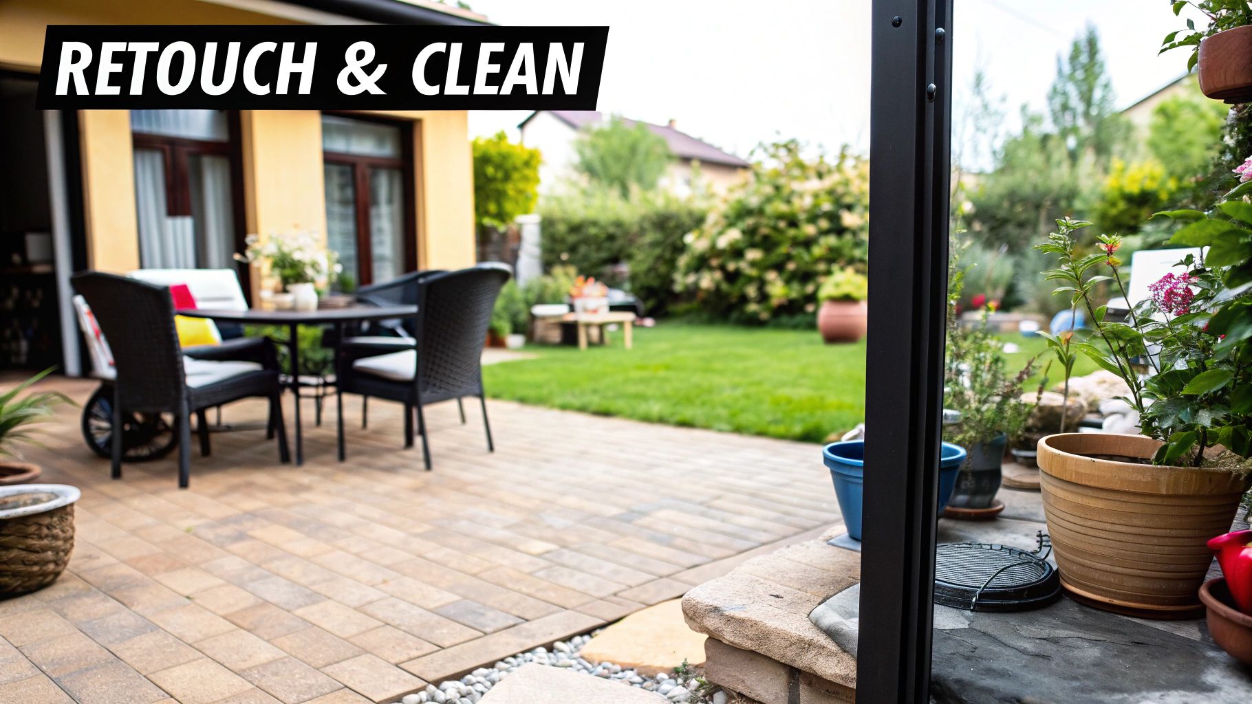
With your colors balanced and lines perfectly straight, we're on to the final polish. This is where you tackle the little imperfections that can pull a buyer's attention away from the big picture. Think of it as a digital cleanup of the property—it’s not about changing what's there, but presenting it in the absolute best light.
The goal is to enhance, not deceive. This is a critical distinction in real estate photography. Removing a permanent crack in the foundation is a serious misrepresentation. Digitally wiping away a small scuff mark on a wall? That's just good presentation.
Erasing Minor Distractions
Every single property has them. A stray power cord snaking along a baseboard, a dead patch on an otherwise gorgeous lawn, or a smudge on a stainless steel fridge. These minor blemishes can break the illusion of a perfect home, but luckily, Lightroom's healing tools make them a non-issue.
- Spot Removal Tool: This is your go-to for small, isolated problems. Think dust spots from your sensor or a nail hole in a wall. Just click on the imperfection, and Lightroom intelligently samples a clean area nearby to patch it up. It's incredibly fast and effective for simple fixes.
- Clone Tool: For more complex jobs, like removing a cord running over a patterned floor, the Clone tool gives you precise control. You get to manually select the exact source area you want to copy from, which is essential for making the patch completely seamless.
These edits are subtle but incredibly powerful. They guide a viewer’s focus right where you want it: on the property's best features, not its tiny flaws.
A good rule of thumb for ethical retouching is this: if it’s temporary or easily fixable in real life, it's generally fine to remove it digitally. A dirty footprint on the carpet can be vacuumed, so erasing it is fair game. A large, permanent stain is part of the property's actual condition and should stay.
Using Masks for Targeted Adjustments
Sometimes, an adjustment across the entire image just won't cut it. You might have a perfectly exposed living room, but the entryway just off to the side is lost in shadow. This is where masking becomes your secret weapon, letting you apply edits to very specific parts of your photo.
For instance, you can drag a Linear Gradient mask to gradually brighten a dark floor or use a Radial Gradient to add a subtle pop of light to a key piece of furniture. For more detailed work, the Brush tool lets you literally paint your adjustments exactly where you need them, like adding a touch of clarity just to the view outside a window.
Once you’ve perfected these local adjustments, you can even package them into your own custom preset. Learning how to save Lightroom presets like a pro will absolutely supercharge your workflow on future shoots.
Enhancing Curb Appeal with Sky Replacement
Nothing kills the vibe of an exterior shot faster than a flat, gray, overcast sky. It can make even the most stunning property look dreary and uninviting. This is, without a doubt, one of the most impactful finishing touches you can make.
Modern editing software has made sky replacement an almost trivial process. In many programs, it's a one-click job where the software automatically finds the old sky and seamlessly blends in a new, more vibrant one.
Swapping a boring sky for a beautiful blue one with some fluffy clouds instantly boosts curb appeal and forges a much stronger emotional connection with potential buyers. This single edit can dramatically shift the perceived value of a home before anyone even sets foot inside.
Exporting Images Optimized for MLS and Web
You've spent all this time making your photos look perfect, but all that hard work can be completely undone by bad export settings. It's a classic mistake. An image that looks stunning on your high-res monitor can turn into a blurry, slow-loading nightmare on an MLS listing or Zillow.
Getting the export process right is the final, crucial step to make sure your photos look professional no matter where they show up.
The trick is to have different export presets for different uses. A photo for a glossy print brochure needs completely different settings than one you're uploading to the web. Forgetting this can tank all your hard work.
Settings for MLS and Web Listings
When you're prepping photos for online use, two things matter above all else: fast loading times and accurate colors. Slow images will just make potential buyers click away, and colors that are off can totally misrepresent a property.
Here are the exact settings I always use in Lightroom for web-ready photos:
- File Type: Stick with JPEG. It's the gold standard for the web and gives you the best balance between quality and file size.
- Color Space: This one is non-negotiable—set it to sRGB. If you use something else like Adobe RGB, the colors might look great on your screen but will often look dull or just plain wrong in most web browsers.
- Quality: I find the sweet spot is somewhere between 75 and 85. This cuts the file size down a ton without any visual quality loss that you'd notice online.
- Resizing: Tick the "Resize to Fit" box and choose "Long Edge." A value between 1800 and 2400 pixels is perfect. It’s big enough for a beautiful full-screen view without being overkill.
One last thing—don't skip sharpening! In the "Output Sharpening" section, check "Sharpen For: Screen" and set the amount to "Standard." It adds that final little pop of crispness that really makes a difference online.
Creating High-Resolution Files for Print
Now, for print materials like flyers or brochures, the rules change. File size isn't a major worry, but maximum quality is everything. If you're just getting started with the software, our complete Lightroom beginner's guide is a great resource to help you get comfortable with all the panels.
For any print-ready files, these are the settings to lock in:
- File Type: JPEG is usually still fine, but if your printer specifically asks for it, TIFF will give you the absolute highest quality.
- Quality: Crank that slider all the way to 100. You want every last bit of data for a clean, sharp print.
- Resolution: Change the "Resolution" field to 300 pixels per inch. This is the industry standard for high-quality printing.
- Resizing: Make sure the "Resize to Fit" box is unchecked. For print, you want to export the photo at its full, original resolution.
I highly recommend creating and saving two separate export presets—one for web, one for print. It takes a minute to set up, but it guarantees your real estate photos are perfectly optimized for every single use case.
Of course, once you start diving into editing, a few common questions always seem to pop up. Let's tackle some of the ones I hear most often from photographers and agents just getting into the groove of editing their own real estate photos.
How Much Retouching Is Too Much?
This is a big one, and it really comes down to ethics. You cross the line when you start misrepresenting a property's permanent condition. It’s perfectly fine to remove temporary things, like a stray garden hose on the lawn or a muddy footprint on the entryway tile. But fixing permanent problems—like a huge crack in the dining room wall or trying to hide significant water damage on a ceiling—is a major no-go. That's deceptive.
The golden rule I always follow is simple: if the issue is temporary or something the seller can easily fix before a showing (like mowing the lawn or cleaning a window), it's probably okay to edit out. The goal is to show the home in its best possible light, not a fictional one.
What Software Is Best for Beginners?
For anyone just starting out, Adobe Lightroom is the undisputed king. Its interface is way more intuitive than Photoshop for the core tasks you’ll be doing over and over again—things like exposure, color correction, and lens adjustments. Lightroom was built from the ground up to help photographers manage and edit huge batches of photos, which is exactly what a typical property shoot gives you.
Should I Use HDR for Every Shot?
Definitely not. High Dynamic Range (HDR) blending is an amazing tool, but you want to be selective with it. It's really meant for high-contrast situations where you have a dark interior but a super bright view out the window. That's where it shines. If you use it on a room with nice, even lighting, you risk making the photo look flat or a little bit fake.
- Use HDR when: You just can't capture both the shadow detail inside and the highlight detail outside in a single shot.
- Skip HDR when: The light across the scene is already pretty even and well-balanced.
Can I Really Just Use Presets?
Yes, but with one small catch. Presets are an incredible starting point and will save you a massive amount of time in getting a consistent, professional look. The thing is, no single preset will be perfect for every photo, simply because the lighting is always a little different from room to room, house to house.
Think of a preset as getting you 80% of the way there in an instant. You'll almost always need to make a few small tweaks to the exposure, white balance, or shadows to really nail the look for that specific image. They’re huge accelerators, not a one-click-and-done solution.
Ready to transform your photos with just a few clicks? Preset Curator offers premium Lightroom presets designed to give your real estate listings a consistent, professional look effortlessly. Explore our collections and find your signature style today at https://presetcurator.com.
Explore our tools: Real Estate Lightroom Presets and Master Bundle.